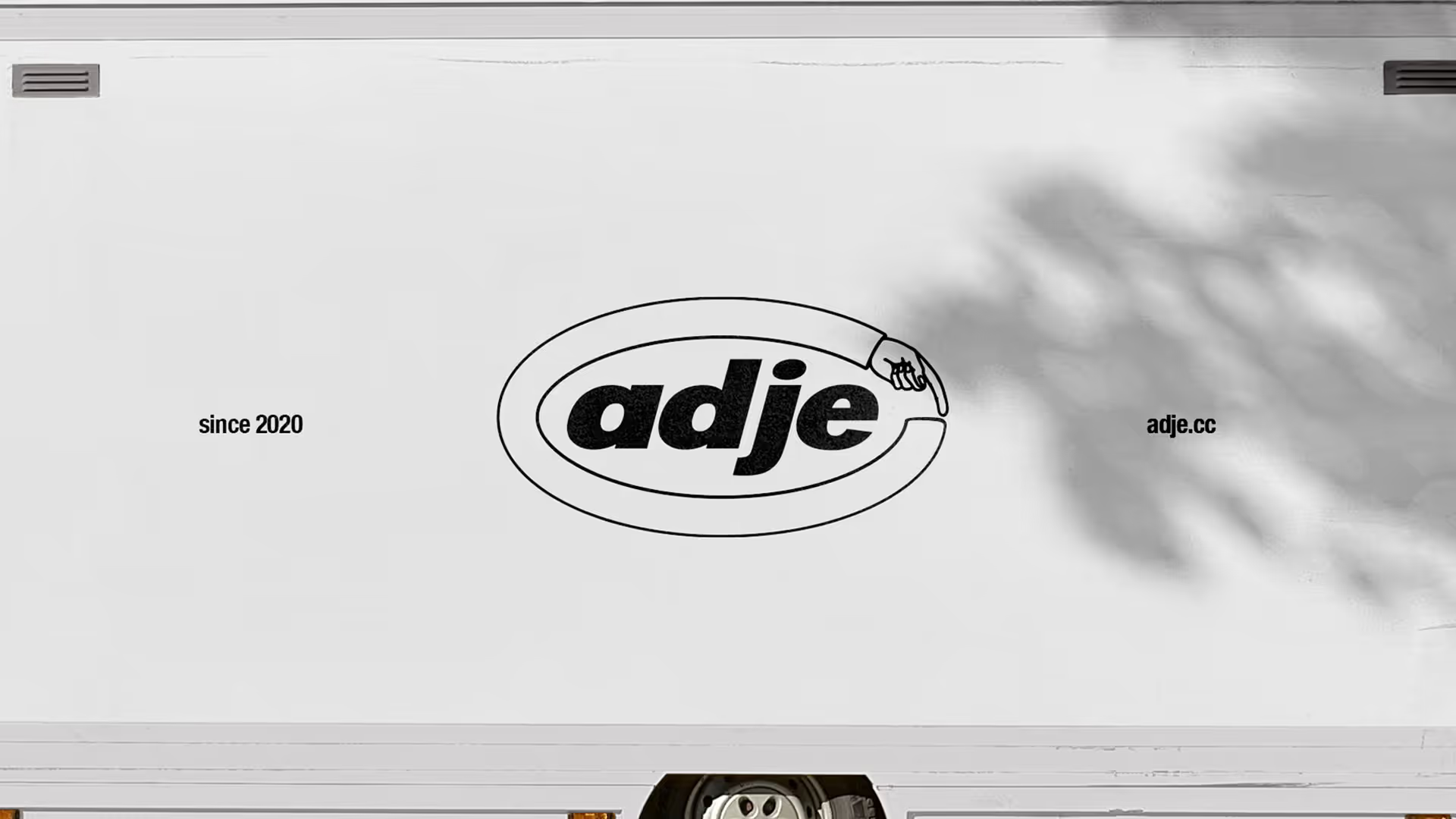
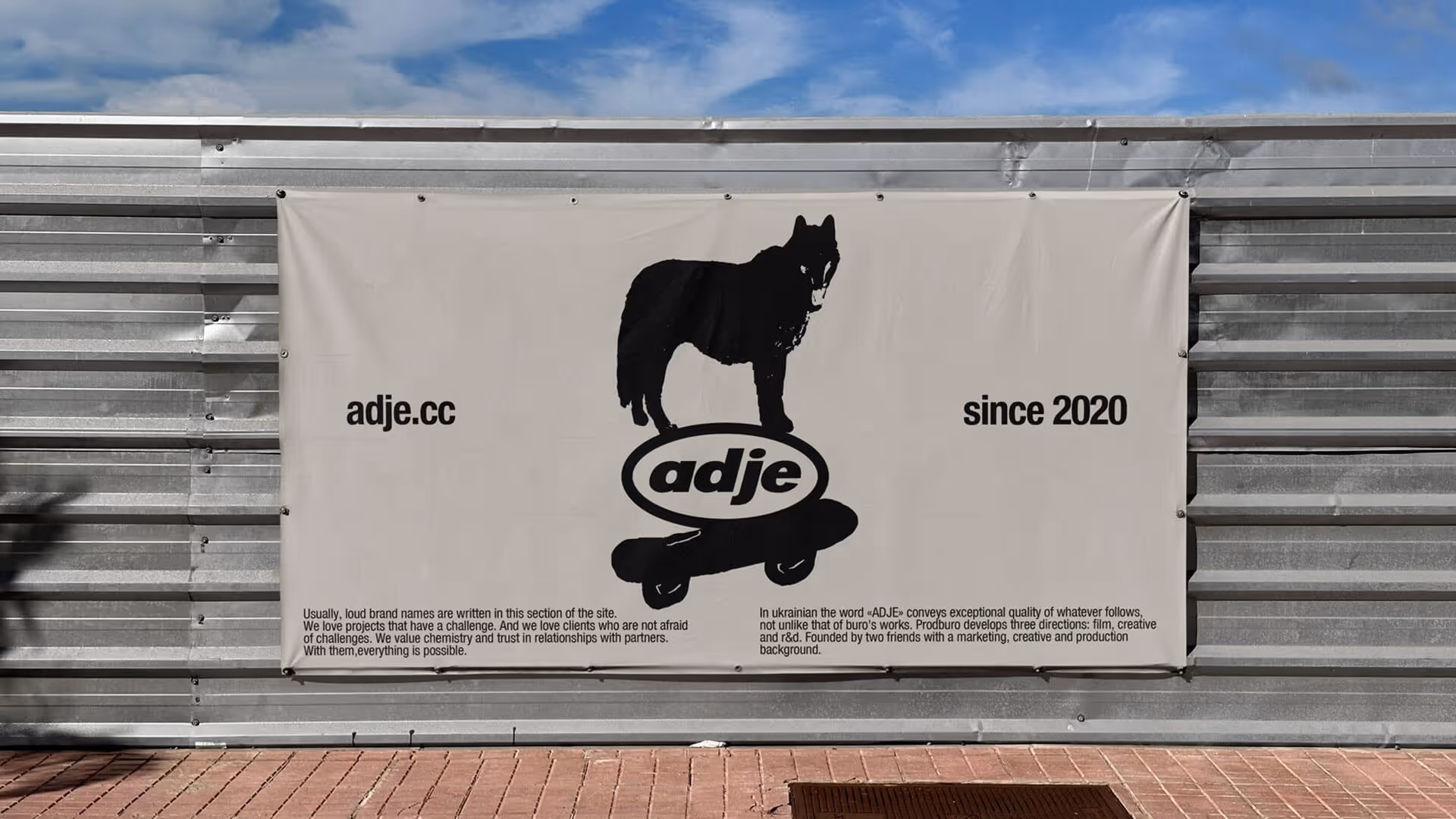
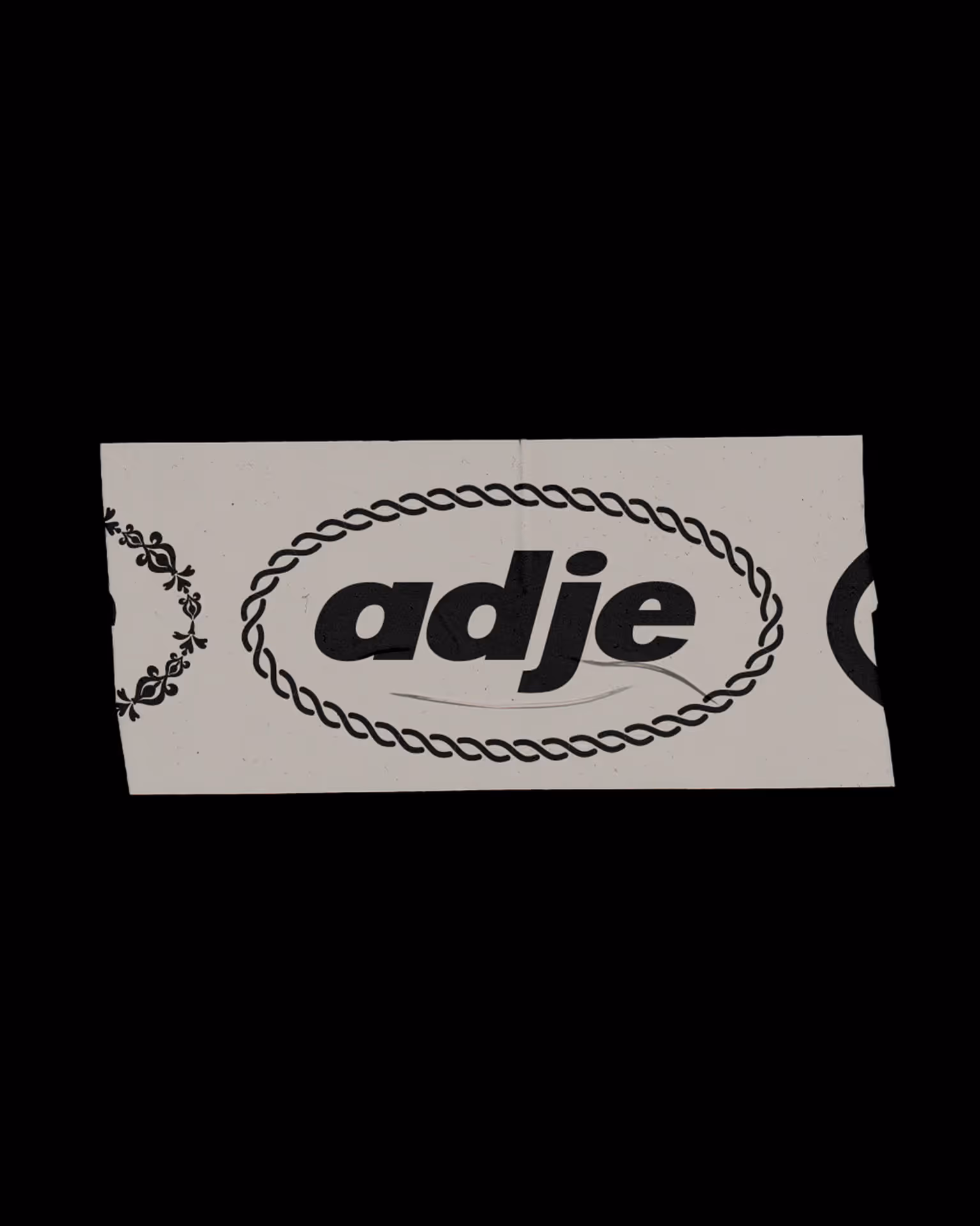
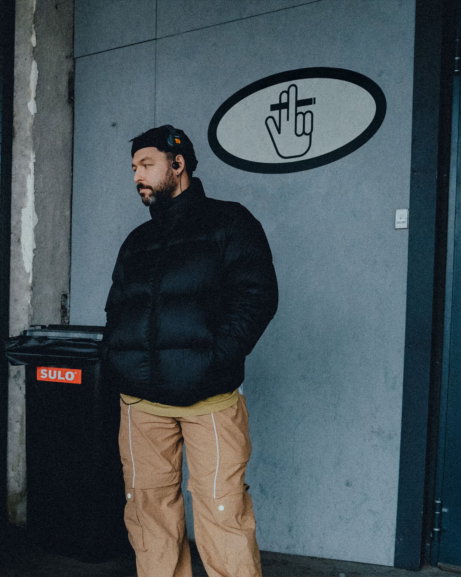
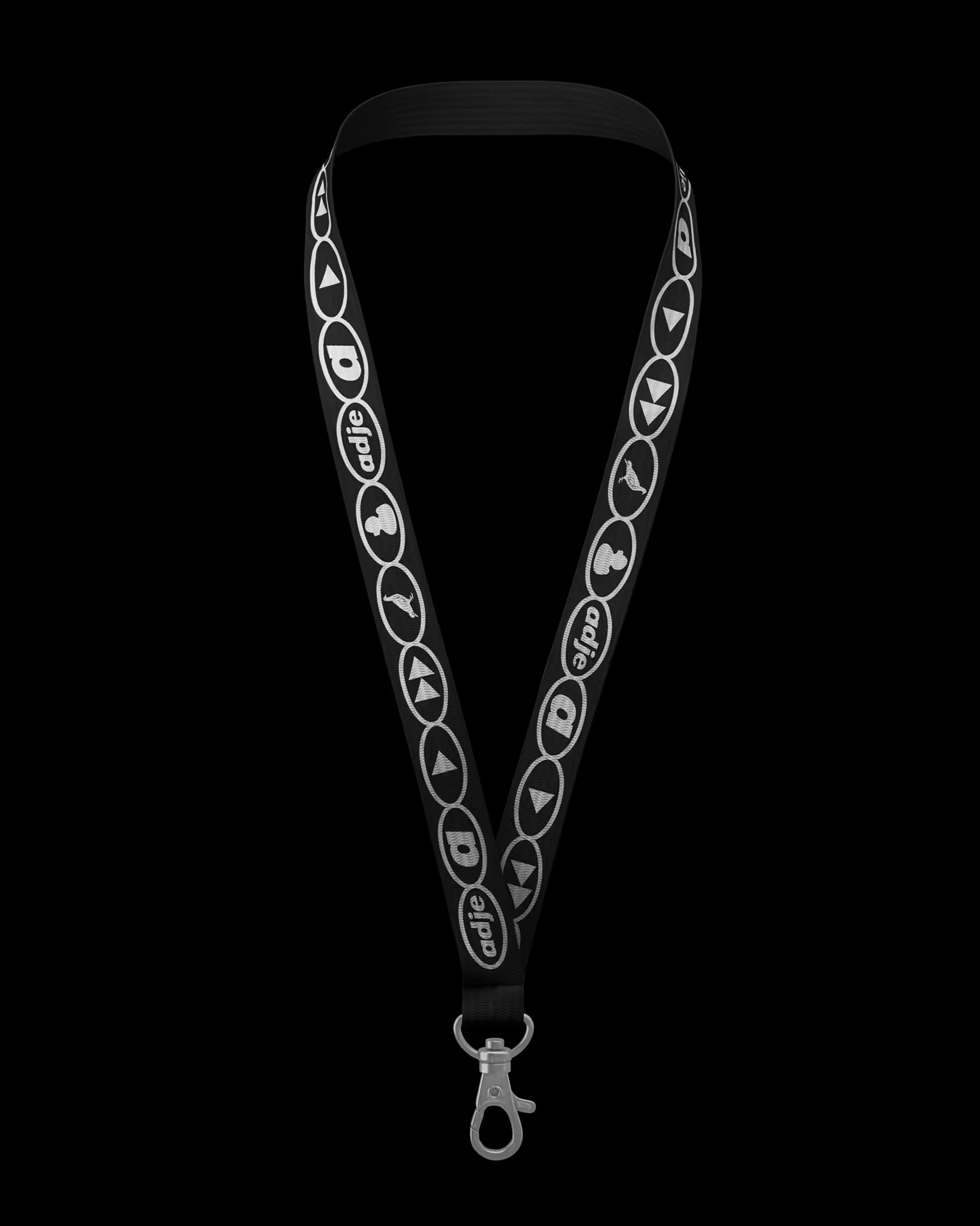
Don Corleone and Adam Sandler — or, more precisely, Mykyta Kukóba and Eugene Golovatenko. Partners, friends, and first and foremost — humans. They founded adje, filled it with ideas, projects, values — and those values started attracting others. That’s how a circle of like-minded people formed. Hence the logo: because what’s an oval, really? Almost a circle.
Rebranding
Motion design
The oval was a key part of adje’s identity — so we kept it. But after five years, the production house gained some weight. The logo matured, got more confident. Now it's lowercase — smoother rhythm, a better reflection of our down-to-earthness.

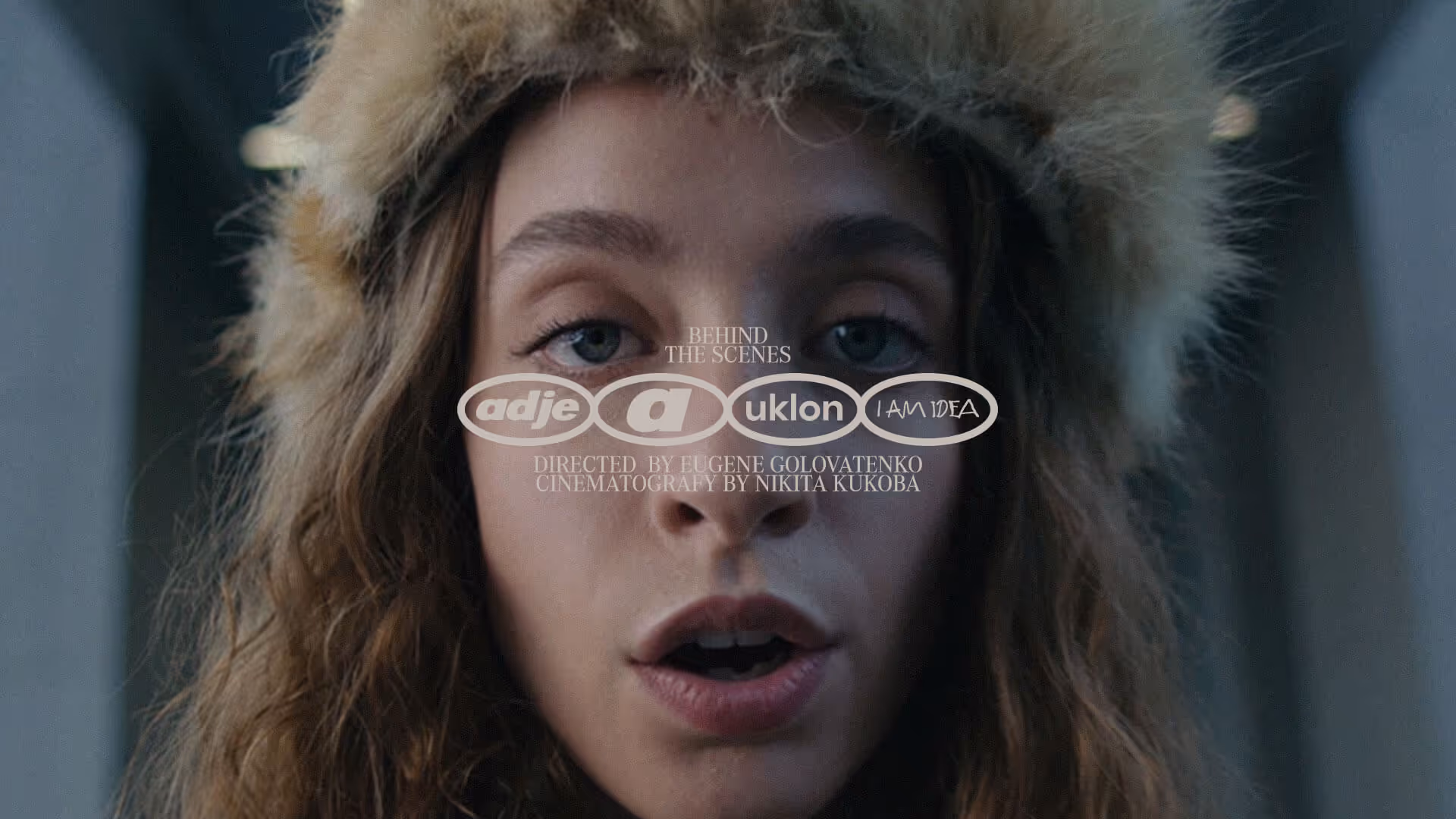

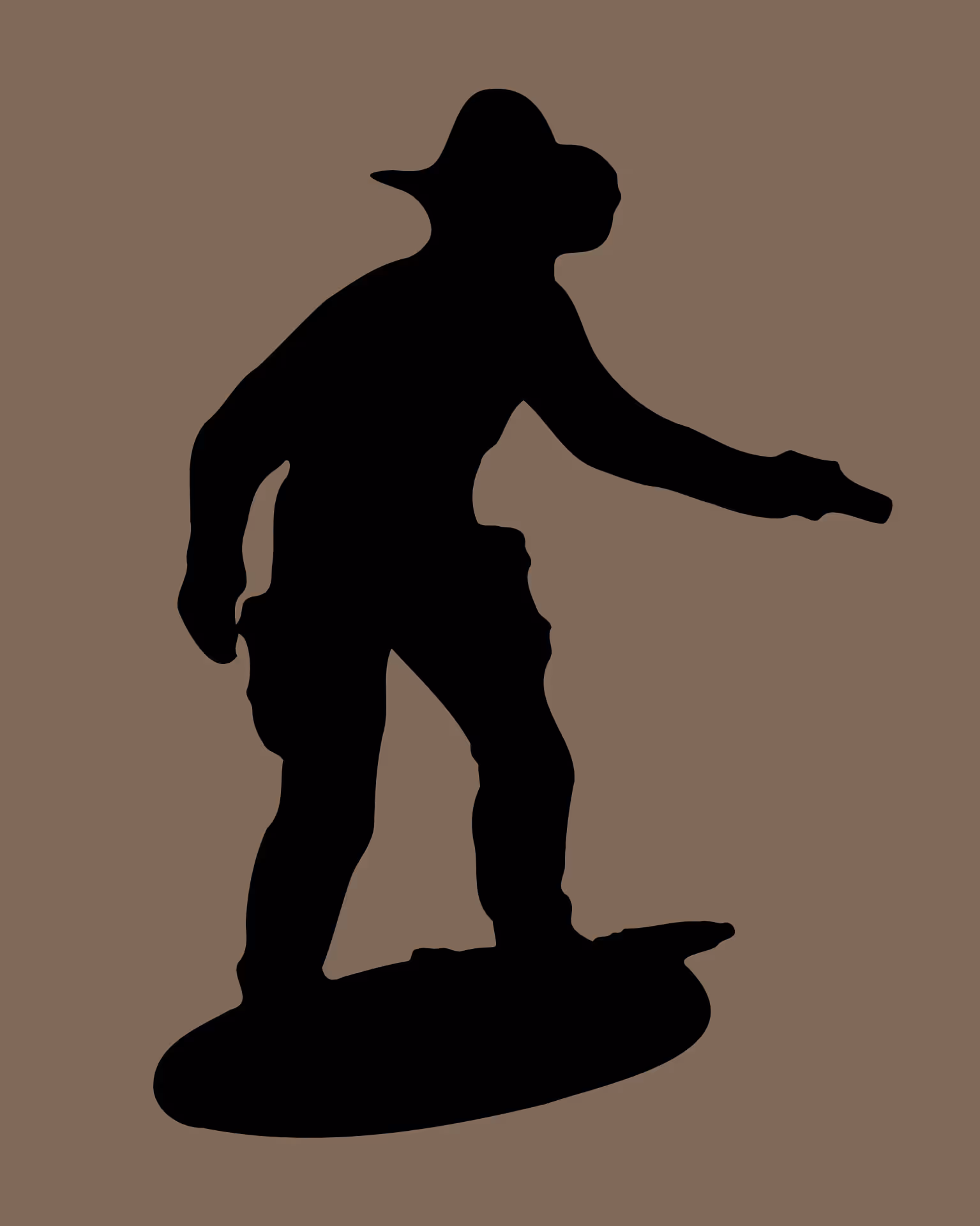

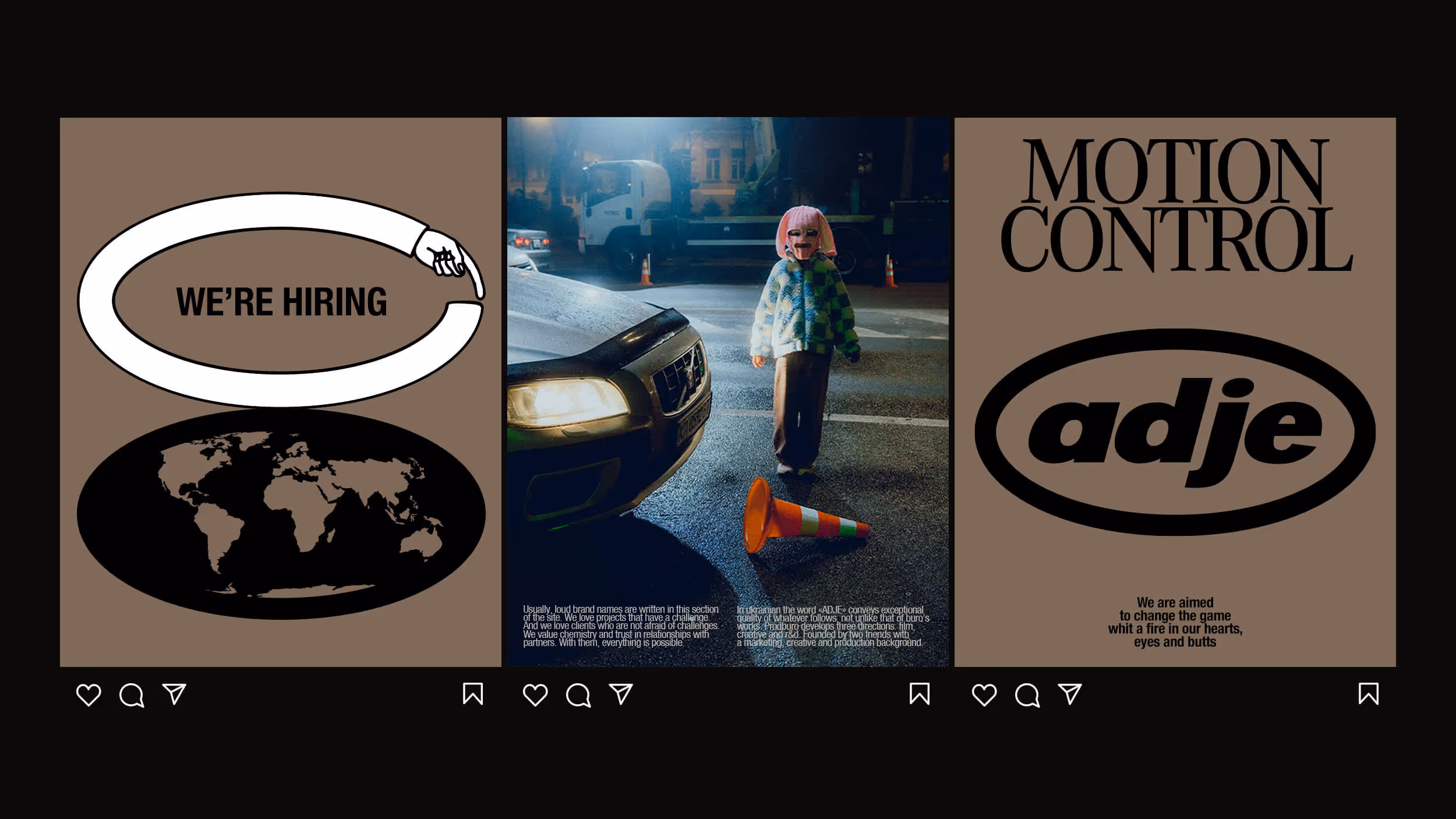
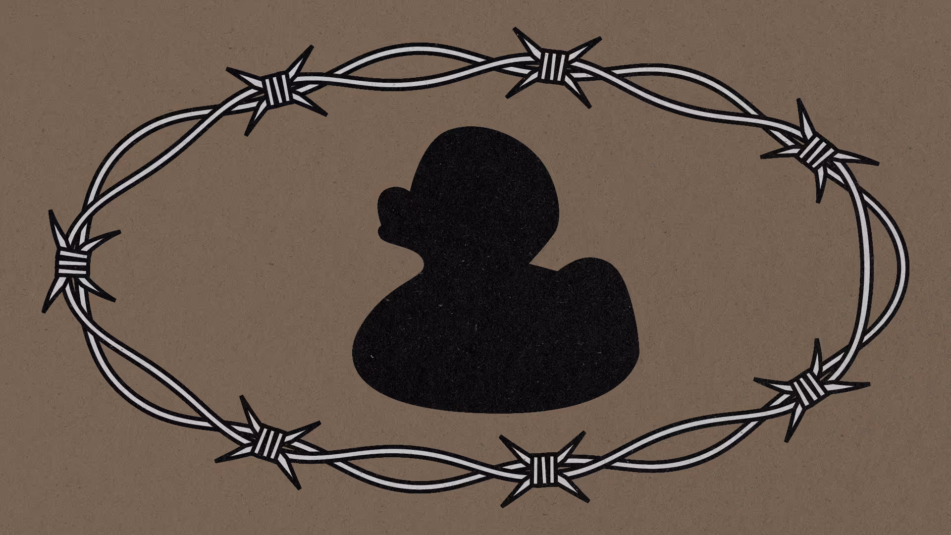
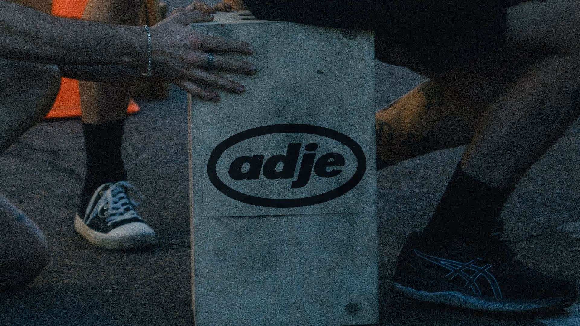
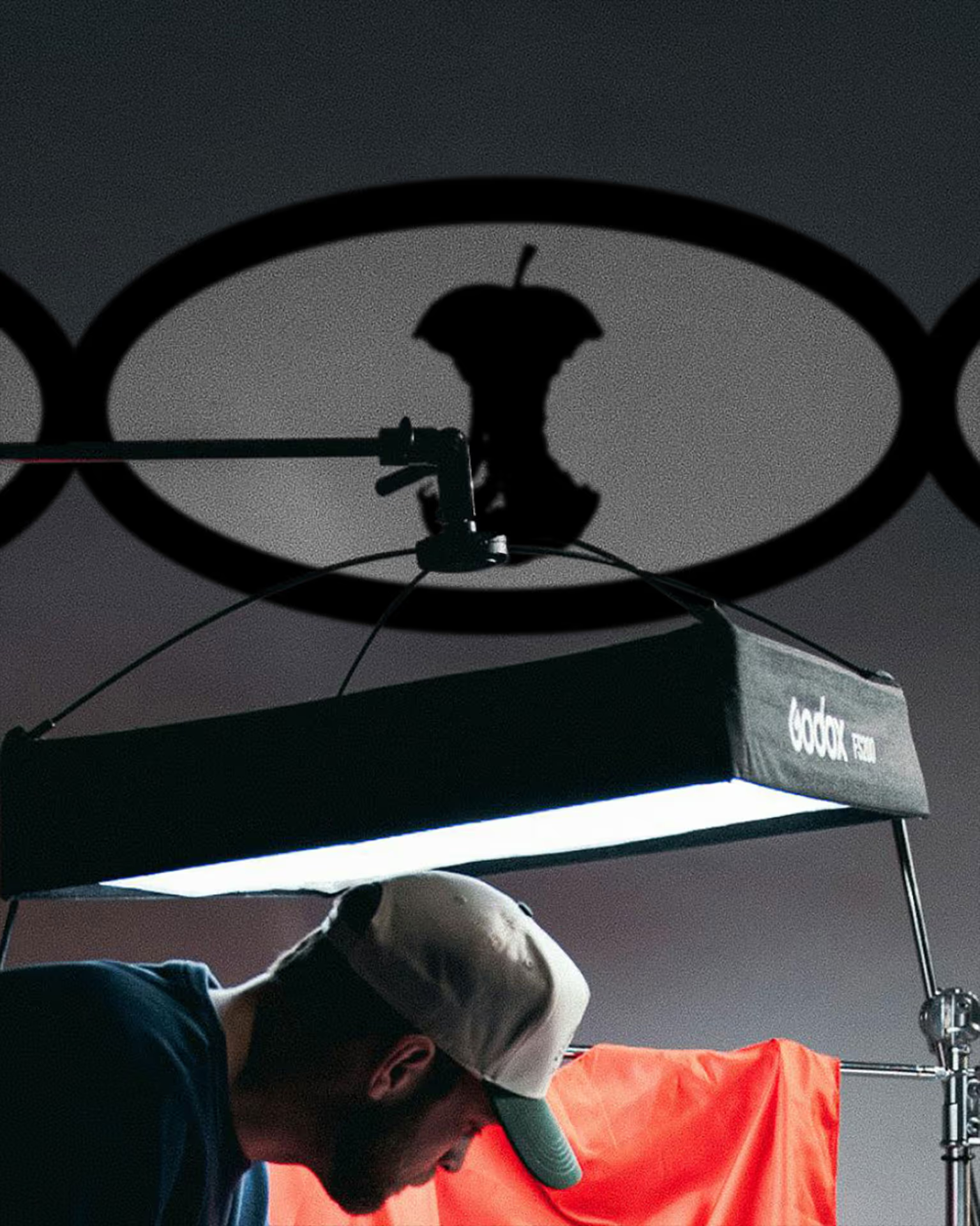
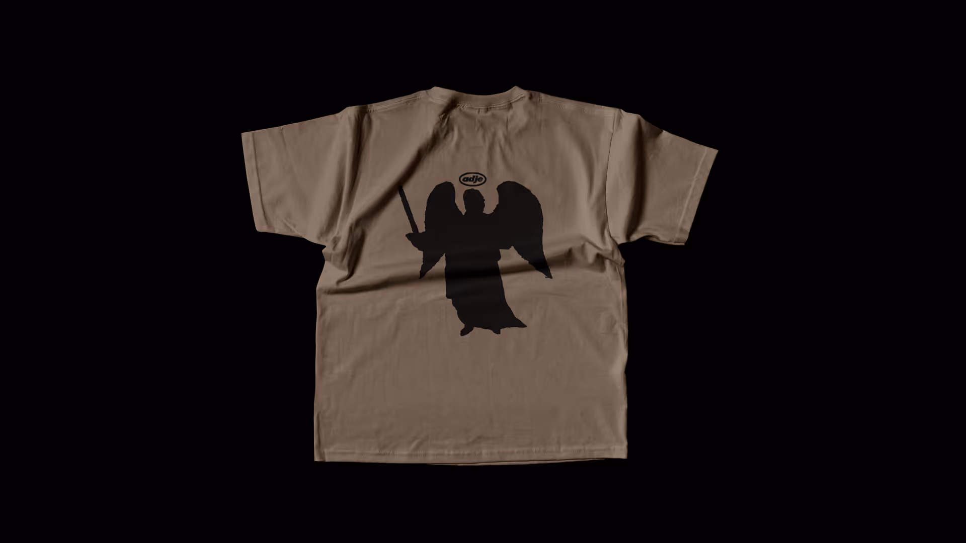
Every project is a new story. That’s why the oval always shifts shape. Sometimes it’s an intricate pattern, sometimes it looks like a traffic line, sometimes a finger. Because a production house should know how to switch gears — from a hilarious commercial for Bashchynski to a dramatic music video for O.Torvald.

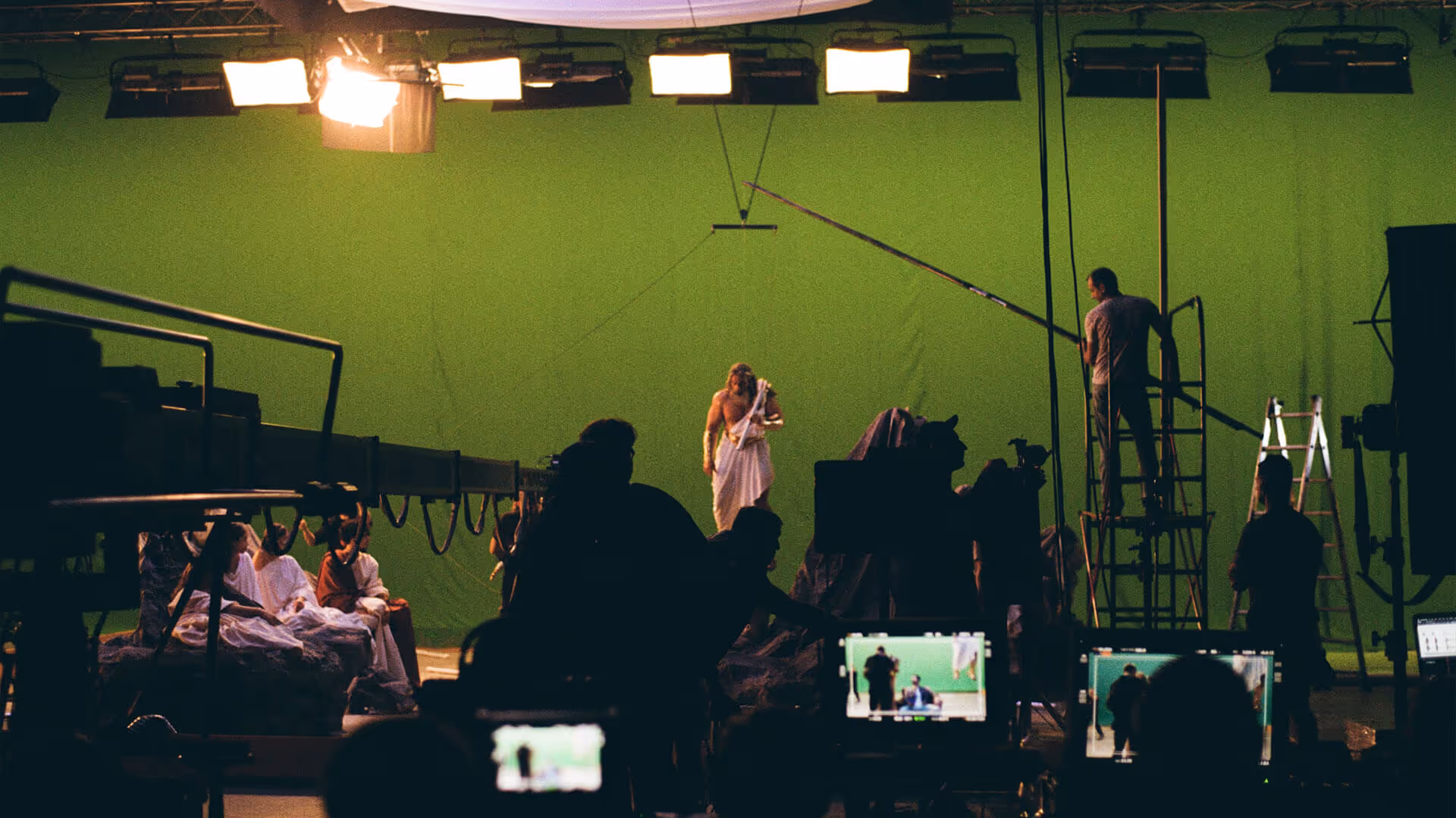
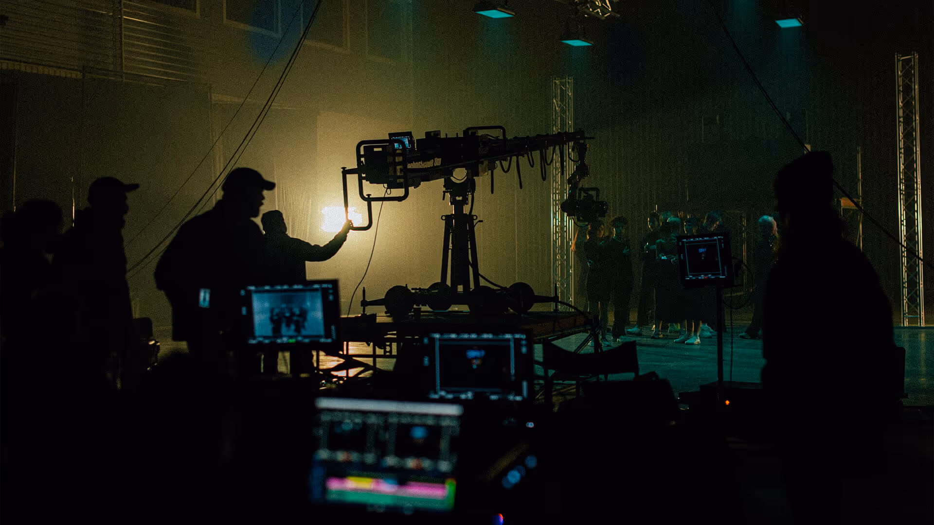
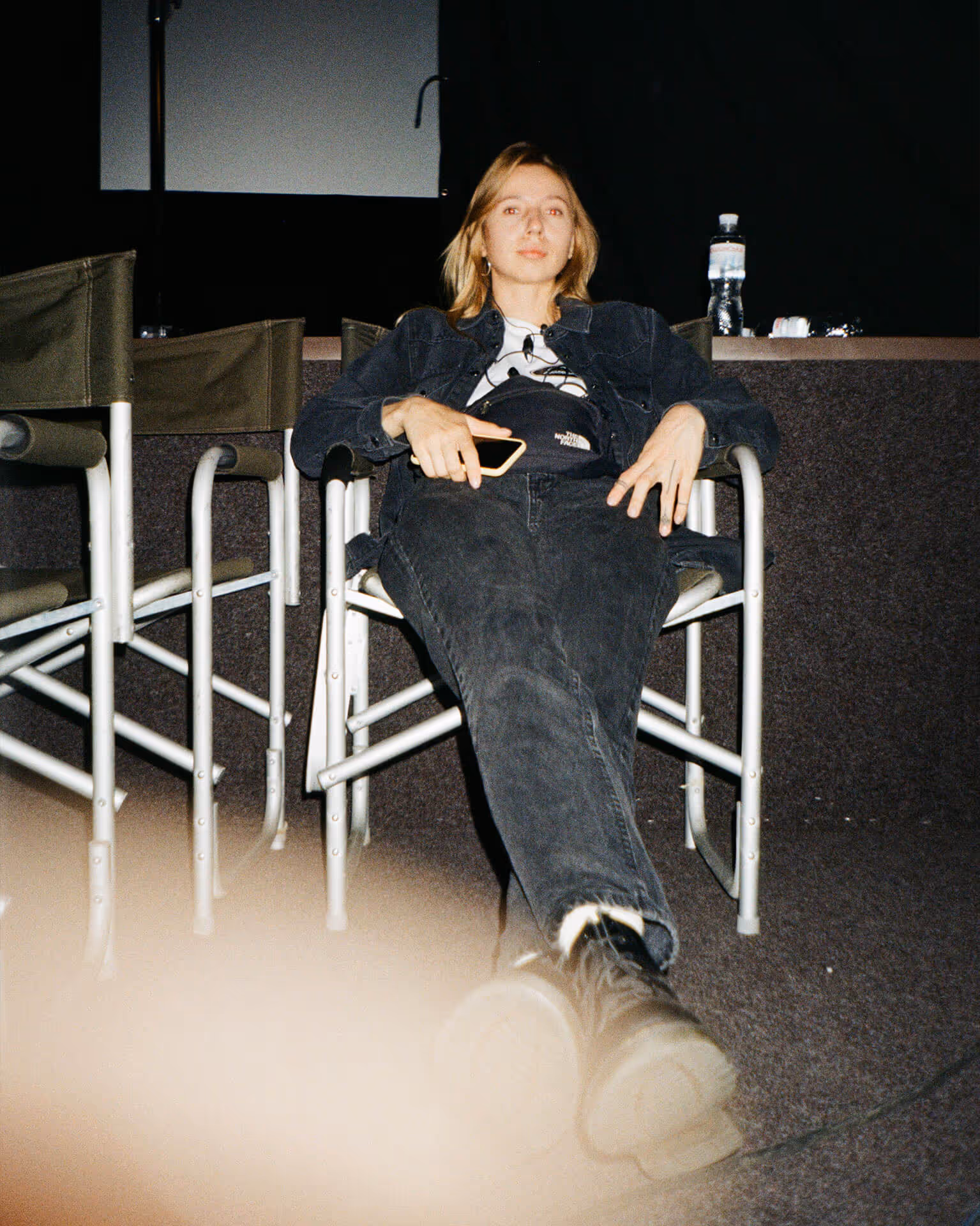
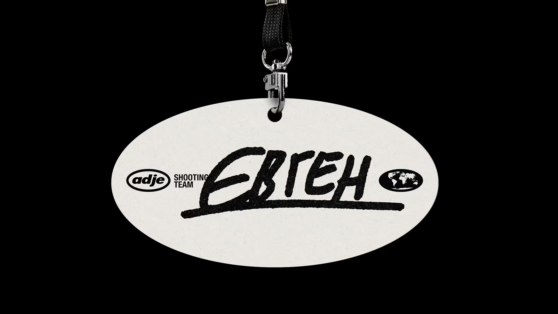
This world is full of artifacts: the crew, the clients, behind-the-scenes moments, props, actors, light, set pieces. Everything’s a little wild and fast-paced. The typography is like subtitles from a festival film mixed with technical timecodes — holding the rhythm together.
The graphics? Whatever flew into the frame: traced icons, accidental forms, fragments.


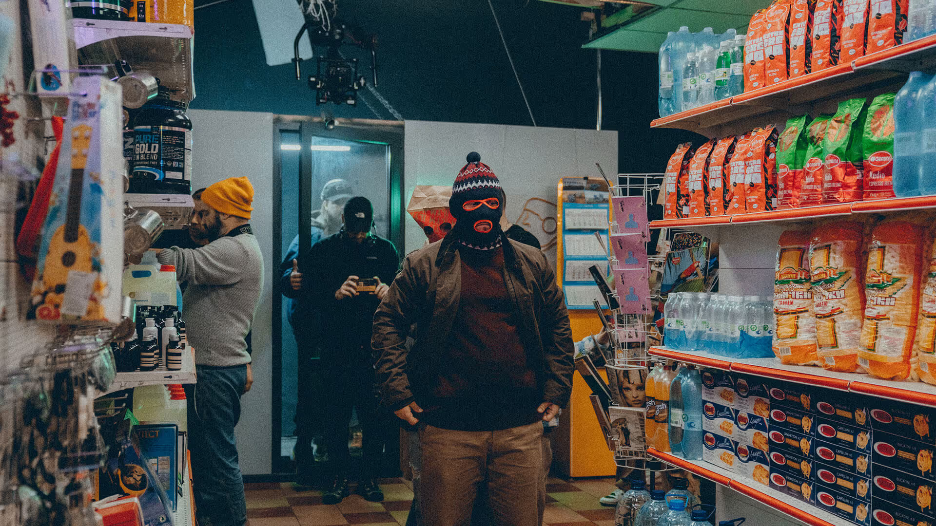
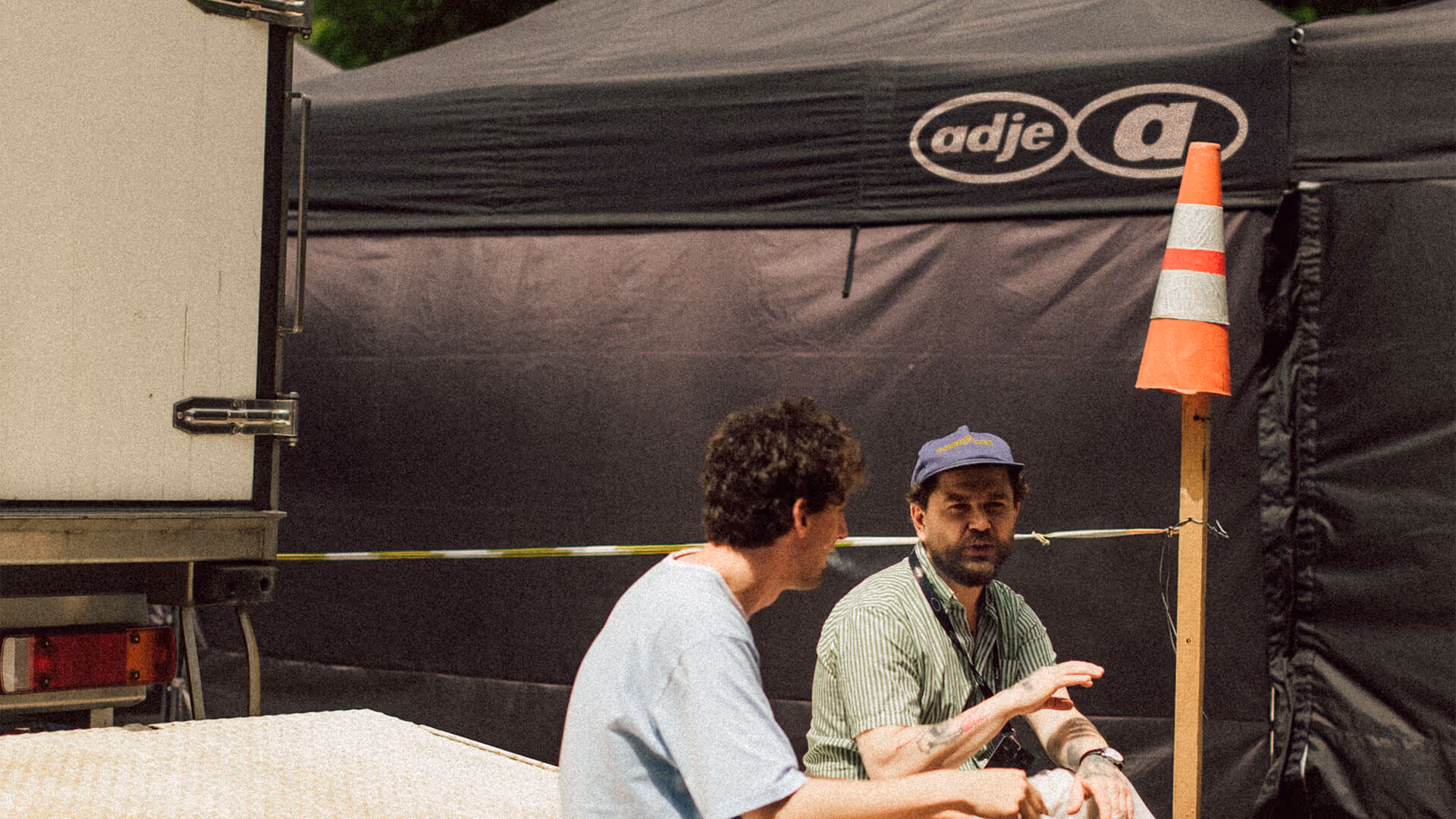
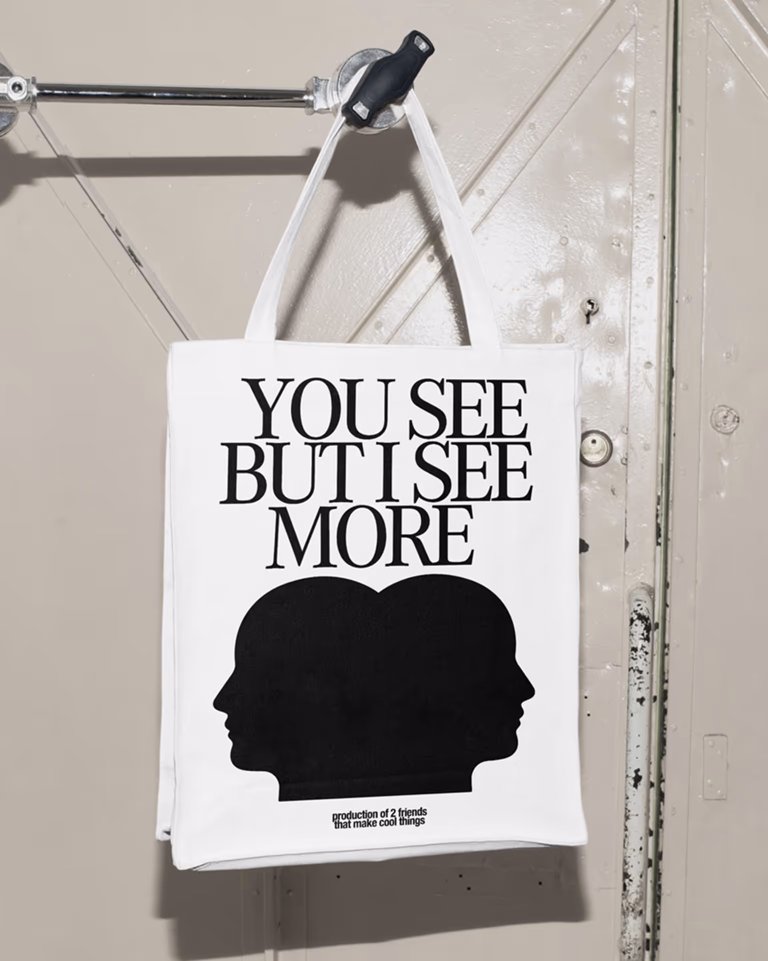
Production is always a mix of chaos, control, ideas, and agreements.

2KA
Creative direction: Vika Moskofidi, Danya Nesterevych
Design: Sima Shpin, Vika Moskofidi, Danya Nesterevych
Project Management: Vlad Novak
Web design: Stas Govorukhin
Adje
Co-founders: Mykyta Kukóba, Eugene Golovatenko
Producers: Natalka Bereza, Danya Feldman
Music: The Lazy Jesus
